
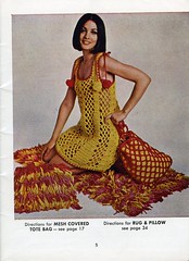
When I look at a picture like this from a vintage pattern book (in this case, "Aunt Lydia's Design Studio," from sometime deep in the 1970s), my first thought is neither "Looks comfortable!" nor "Boy, don't I wish I my crochet skills were up to something that complex!" nor "That model is clearly bereft of any kind of undergarments." No, friends, these are secondary notions. The first thing to churn to the surface in my brain is actually, "Does it come in any color BESIDES yellow?"
I have friends who look amazing in marigold, sunshine, canary, butter, and topaz, but I never have. In fact, I've never given the hues that fall between green and red on the color wheel much of a shot. Lately I've dabbled in orange, which would feel considerably more daring if I didn't live in Austin, Texas. Burnt orange and white are the UT Austin colors, and Austin is heaven for orange stuff: If something orange is very, very good, when it dies it will wake up and find itself here, whether it is a car or a cardigan, yarn or yard equipment. It's really only natural that, as I enter my fifth year of seeing people wearing UT shirts ALL OVER THE PLACE (including to their actual classes AT the University on non-game days, which seems to me kind of like wearing the band t-shirt to the concert of that band...but hey, maybe I'm wrong about that), I would be coming to accept orange as something wearable, even by me. Burnt orange I still don't know that I love on me yet, but I've gotten daring with some stuff in the vermilion and tangerine families lately, if you can believe that.
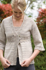
The next logical step would be for me to branch out into yellow, right? Well, I might want to count St. Moritz (Ravelry details here) as that step. It's my design contribution to the new book Knitting it Old School, edited by my pals Caro and Stitchy, which is sure to be the must-have pattern book for this fall. (I've provided an Amazon link just off to the left there, for your convenience. Wasn't that nice of me? Just click on the li'l ol' Buy Now button, kiddo...THERE you go!) They asked me for some ideas for a vintage-inspired piece and then sent me the yarn to make it with, and I was, I must admit, kinda sorta horrified when I opened the box and saw exactly what "lemon ice" looked like. There was just an awful lot of yellow in one place there. More than a law firm's worth of legal pads. More than a cageful of canaries. Like a handful of highlighters had leaked all over a nice bag of cream-colored yarn, maybe. OK, not as bad as that last one, but whew, definitely more yellow yarn than I'd ever thought I'd be using on one project.
 As I swatched it, I fretted. Yellow is so LIGHT. I'd have to wash my hands each time I picked up this project! The beginning of the garment would get all soiled, and the end of it would be all bright and fresh! I'd have to keep it in a plastic bag if I took it anywhere, in case I spilled on it! And waaah, I don't like yellow! As it turned out, working this yellow garment ended up instilling some better knitterly habits in me. You should always wash your hands before picking up a knitting project, after all, and ladies, if you're putting your knitting in a handbag that has EVER carried makeup, too, you should put it in its own clean bag. (So sayeth the girl who has had to gently rinse lip-liner crumbs out of a ball of lace weight cashmere.) And of course the color grew on me. (Who saw that one coming? OK, cleversticks; you win. You're smarter than me.) This stuff really DOES look like lemon ice--even though I was working on it during two of the eleven-point-five wicked hot months we have here in Texas, it didn't seem like as steamy a lapful as other (less refreshingly-colored) sweaters I have knitted. The upshot is that knitting with yellow yarn is now on the list of things I won't automatically rule out, which makes me feel ever so adventurous and broad-minded and whatnot.
In fact, I had such a good experience with this yellow yarn that the very next week I ordered a bunch of yellow sock yarn to test-knit my Myrtle design in, figuring I'd give the finished garment to one of my yellow-wearing friends. But when THAT yellow yarn arrived, it was--I'm truly sorry to say this, because I love the company I ordered it from, and they're usually quite tasteful with color--Fuh. Gly. Like, it REALLY looked like a highlighter leaked in there. I couldn't even swatch with it--this yarn was way, way over my yellow limit. So I had my friend Stephi dye it green. Baby steps, folks, baby steps...


3 comments:
I will think of this post every time I contemplate the color "yellow." Such a beautiful garment!
A friend of mine's son once stated that "Lello starts with 'L'". There's no arguing with that.
Oh, it's lovely. I'll bet your "gah" yellow was KP Shine Sport. In the catalog and on the interwebs it looks so pretty and buttery. In real life, ACK! My eyes! Too Bright!
Hah! Although that WAS my exact reaction, it was NOT KP Shine Sport. It was CTH Supersock Solid (since discontinued...which only confirms my belief that the color was Not What Mother Nature Would Consider Right).
Post a Comment